5 Easy Tips for a Secure and Professional ID Card Design

Your identity card design has so much potential! There are so many ways to make your company a more secure and comfortable place, but implementing high quality, professionally designed ID cards is one of the easiest and most cost effect means of doing so. That being said, there are a few measures that you should take to ensure that your ID design is working as well as it can for you and your company. Follow these five simple design tips for secure, professional identity cards with every single print…
Keep it simple
This is probably the easiest and most effective tip to follow if you want uniform, functional identity cards that stand the test of time. The real key to powerful design is not what you put on your card, but what you don’t. Practicing restraint when designing something as vital as an identity card will enable your final output to be as impactful and successfully put together as possible. Keep it simple with limited content, to the point text and uncrowded composition to make your cards digestible and usable. The simpler side of things is also infinitely more classic and looks professional just by its refined nature, making it an easy and tactful selection for any environment.
Use clear and clean images
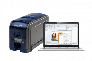
High quality images are a must for professional looking identity cards. The whole objective of your card is to prove the identity of the carrier, and if a picture is faded, pixellated or washed out, then this becomes tricky to do. Whilst more and more plastic cards are adopting increasingly sophisticated proximity and Mifare technology, a clean and clear image is still integral to professionally designed and functional cards. The use of a proper camera, good lighting, integrated card design software and a professional ID card printer will ensure that the quality of your photographs is up to scratch.
Include the vital details
Before you hit print, double check that you’ve listed all of the essential details on your ID cards. Vital specifications will vary depending on your unique needs and priorities, however, this is largely going to include card carrier names, photographs and the company, institution or building name. Other details can be included should you require them, however, those specifications really must be present in order to make your cards fully functional.
Choose your background carefully
Whilst it might be incredibly tempting to create ID cards that really stand out from the crowd, you should second guess that bold and bright background colour decision. This can distort the security function of your IDs, rendering them less useful and therefore not quite as worth your investment. Curb away from the crazy choices and opt for a solid background colour, if you really want to go for something unique you can also add a watermark or company logo. Always prioritise the visibility of your cards’ text and the operation of any security functions such as a magnetic stripe, bar code or other technologies.
Stick to minimalist design decisions
You’ll have to practice the minimalist mindset when making every design decision for your identity cards, including your choice of text. Pay attention to the readability of the font that you use. Choosing a clean and simple font that is sans-serif will help to make it as comprehensible and clear as possible. You should also double check everything for any spelling errors or mistakes as these diminish the professionalism of your cards immediately.
And there you have it! Follow these five easy tips on how to secure id card designs. Remember that ID card accessories will enhance the impact that your cards have on your company’s safety standards and ensure that those carefully designed IDs stay pristine and functional for longer.